bgm: https://music.163.com/#/song?id=490182455&userid=361029804
Theme song of the movie "NO GAME NO LIFE Zero"

Introduction#
In today's frontend development, floating elements play an increasingly important role. They provide users with additional interactions and information without affecting the overall layout of the page. Floating UI is a JavaScript library designed to facilitate the positioning and creation of floating elements. With it, you can easily control the position and interaction effects of floating elements, thereby enhancing the user experience.
If you are looking for a simple and easy-to-use floating element solution, Floating UI may not be your best choice. The main goal of this library is to provide anchor point positioning functionality rather than pre-built styles or other advanced interaction effects. However, if you are proficient in React and wish to use such a highly customizable library, you can make better use of it.
This library is intentionally "low-level," and its sole purpose is to provide "anchor point positioning." Think of it as a polyfill for a missing CSS feature. No pre-built styles are provided, and user interactions are only applicable to React users.
If you are looking for out-of-the-box simple functionality, you may find other libraries more suitable for your use case.
I prefer to refer to this article as an experience sharing on using Floating UI in React, especially the methods of using this library in React, rather than a tutorial. In practice, I found that the documentation and examples for Floating UI are quite detailed, but there is a lack of Chinese materials, so I wanted to consolidate some information for future reference and hope to provide some help and reference for those in need. (Of course, the quickest way is to directly check the English documentation and examples to search for API usage.)
Installation#
You can install Floating UI via a package manager or CDN. If you are using npm, yarn, or pnpm, you can run the following command:
npm install @floating-ui/dom
If you are using a CDN, you can add the following tag to your HTML file:
<script src="https://cdn.jsdelivr.net/npm/@floating-ui/dom"></script>
For more details, see: Getting Started | Floating UI
Installation in React#
To install in React, simply install the @floating-ui/react package:
yarn add @floating-ui/react
Popover#
In this article, I will share how to use Floating UI to create a common floating UI component—Popover. A Popover is a common floating UI component that typically appears when a user hovers over or clicks on an element to provide additional information or options.
Case Demonstration#
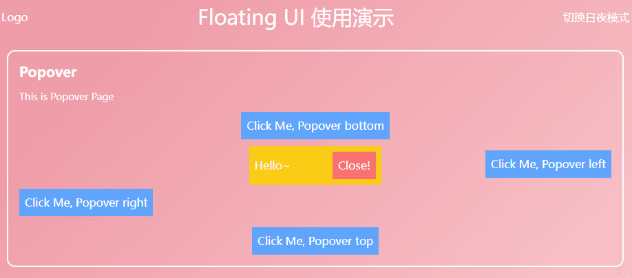
Through the following learning, you can easily build a bubble/pop-up that appears on click, as shown in the image.
Demo demonstration 👉 CodeSandbox
useFloating#
First, the core hook—useFloating
The useFloating hook provides positioning and context for floating elements. We need to pass some information:
open: The open state of the pop-up.onOpenChange: A callback function that will be called when the pop-up opens or closes. Floating UI will use it internally to update theirisOpenstate.placement: The position of the floating element relative to the reference element, with the default position being'bottom', but you may want to place the tooltip in any position relative to the button. For this, Floating UI has aplacementoption.- The available basic positions are
'top','right','bottom','left'. - Each of these basic positions can be aligned with
-startand-end. For example,'right-start'or'bottom-end'. These allow you to align the tooltip with the edge of the button rather than centering it.
- The available basic positions are
middleware: Import and pass middleware into an array to ensure the pop-up remains on the screen, regardless of where it is ultimately placed.autoPlacementis useful when you don't know which position is best for the floating element or don't want to specify it explicitly.- Middleware | Floating UI Other middleware can be found in the documentation, including offset (set offset), arrow (add small arrow), shift (move the floating element along a specified axis to keep it visible), flip (flip the position of the floating element to keep it visible), inline (improve positioning of inline reference elements across multiple lines), and other useful middleware.
whileElementsMounted: Only updates the position when both the reference element and the floating element are mounted, ensuring the floating element remains anchored to the reference element.- autoUpdate If the user scrolls or resizes the screen, the floating element may separate from the reference element, so its position needs to be updated again to ensure it remains anchored.
import { useFloating, autoUpdate, offset, flip, shift } from '@floating-ui/react';

function Popover() {
  const [isOpen, setIsOpen] = useState(false);

  const { x, y, strategy, refs, context } = useFloating({
    open: isOpen,
    onOpenChange: setIsOpen,
    middleware: [offset(10), flip(), shift()],
    placement: 'top',
    whileElementsMounted: autoUpdate,
  });
}
Interaction hooks - useInteractions#
Use
useInteractionswith a configuration object to enable the floating element to extend open, close behaviors or be accessible to screen readers. In this example,useClick()adds the functionality to toggle the pop-up open or closed when clicking the reference element.useDismiss()adds the functionality to close the pop-up when the user presses theesckey or clicks outside the pop-up.useRole()adds the correctARIAattributes fordialogto the pop-up and reference element. Finally,useInteractions()merges all their props into prop getters that can be used for rendering.
Some configuration objects enable the floating element to extend open, close behaviors or be accessible to screen readers.
import {
  // ...
  useClick,
  useDismiss,
  useRole,
  useInteractions,
} from '@floating-ui/react';

function Popover() {
  const [isOpen, setIsOpen] = useState(false);

  const { x, y, reference, floating, strategy, context } = useFloating({
    open: isOpen,
    onOpenChange: setIsOpen,
    middleware: [offset(10), flip(), shift()],
    whileElementsMounted: autoUpdate,
  });

  const click = useClick(context);
  const dismiss = useDismiss(context);
  const role = useRole(context);

  // Merge all the interactions into prop getters
  const { getReferenceProps, getFloatingProps } = useInteractions([click, dismiss, role]);
}
useClick()adds the functionality to toggle the pop-up open or closed when clicking the reference element.useDismiss()adds the functionality to close the pop-up when the user presses theesckey or clicks outside the pop-up.useRole()adds the correctARIAattributes fordialogto the pop-up and reference element.
Finally, useInteractions() merges all their props into prop getters that can be used for rendering.
Rendering#
Now that we have set up all the variables and hooks, we can render our elements.
function Popover() {
  // ...
  return (
    <>
      <button ref={refs.setReference} {...getReferenceProps()}>
        Reference element
      </button>
      {isOpen && (
        <FloatingFocusManager context={context} modal={false}>
          <div
            ref={refs.setFloating}
            style={{
              position: strategy,
              top: y ?? 0,
              left: x ?? 0,
              width: 'max-content',
            }}
            {...getFloatingProps()}
          >
            Popover element
          </div>
        </FloatingFocusManager>
      )}
    </>
  );
}
getReferenceProps&getFloatingPropsreturned byuseInteractionsare spread onto the relevant elements. They contain relevant props such asonClick,aria-expanded, etc.<FloatingFocusManager />is a component for managing modal or non-modal behavior of the popover focus. It should directly wrap the floating element and should only be rendered when the popover is also rendered.FloatingFocusManager—FloatingFocusManagerdocs.
Modal and non-modal behavior#
In the example above, we used non-modal focus management, but the focus management behavior of the pop-up can be either modal or non-modal. The differences are as follows:
Modal#
- The pop-up and its content are the only elements that can receive focus. When the pop-up is open, the user cannot interact with the rest of the page (nor can screen readers) until the pop-up is closed.
- Requires a clear close button (though it can be visually hidden).
This behavior is the default behavior:
<FloatingFocusManager context={context}>
  <div />
</FloatingFocusManager>
Non-modal#
- The pop-up and its content can receive focus, but the user can still interact with the rest of the page.
- When tabbing out, the pop-up will automatically close on losing focus, and the next focusable element in the natural DOM order will receive focus.
- No explicit close button is required.
This behavior can be configured using the modal prop as follows:
<FloatingFocusManager context={context} modal={false}>
  <div />
</FloatingFocusManager>
Complete Code#
With a bit of optimization, you can easily create such a Popover component:
import {
  FloatingFocusManager,
  Placement,
  autoUpdate,
  useFloating,
  useInteractions,
  shift,
  offset,
  flip,
  useClick,
  useRole,
  useDismiss,
} from '@floating-ui/react';
import { cloneElement, useEffect, useId, useState } from 'react';

type PopoverProps = {
  disabled?: boolean;
  open?: boolean;
  onOpenChange?: (open: boolean) => void;
  render: (props: { close: () => void }) => React.ReactNode;
  placement?: Placement;
  children: JSX.Element;

  className?: string;
};
const Popover = ({ disabled, children, render, placement, open: passedOpen, onOpenChange }: PopoverProps) => {
  const [open, setOpen] = useState(false);
  const { x, y, reference, floating, strategy, context } = useFloating({
    open,
    onOpenChange: (op) => {
      if (disabled) return;
      setOpen(op);
      onOpenChange?.(op);
    },
    middleware: [offset(10), flip(), shift()],
    placement,
    whileElementsMounted: autoUpdate,
  });
  const { getReferenceProps, getFloatingProps } = useInteractions([useClick(context), useRole(context), useDismiss(context)]);

  const headingId = useId();

  useEffect(() => {
    if (passedOpen === undefined) return;
    setOpen(passedOpen);
  }, [passedOpen]);

  return (
    <>
      {cloneElement(children, getReferenceProps({ ref: reference, ...children.props }))}
      {open && (
        <FloatingFocusManager context={context} modal={false}>
          <div
            ref={floating}
            style={{
              position: strategy,
              top: y ?? 0,
              left: x ?? 0,
            }}
            className="z-10 bg-yellow-400 p-2 outline-none"
            aria-labelledby={headingId}
            {...getFloatingProps()}
          >
            {render({
              close: () => {
                setOpen(false);
                onOpenChange?.(false);
              },
            })}
          </div>
        </FloatingFocusManager>
      )}
    </>
  );
};
export default Popover;
Conclusion#
Next time, I will introduce the creation and encapsulation of Dialog | Floating UI, including an introduction to FloatingPortal and FloatingOverlay, which have similar interactions to popovers but with two main differences:
- It is modal and presents a background behind the dialog, dimming the content behind it, making the rest of the page inaccessible.
- It is centered in the viewport and not anchored to any specific reference element.
I highly recommend everyone to read the Floating UI official documentation, as I really like its concepts, both in terms of middleware and the level of abstraction of hooks.